This website has loads of different fonts that we could choose from. The fonts were in categories: such as Horror, Gothic, Fancy, Cartoon, Script, Foreign and Simple.


We looked at the appropriate catagories for our thriller, they were horror, distorted and gothic. We looked on these catagories because we thought that it would provide us with the type and styles of font that would fit well with the genre of our thriller film. The ones we chose are:
We choose this font because we thought that it met all of the conventions that we wanted it to meet. This font came from the Horror category. Although we think that this font is good, we believe that it is a little to formal for our main title and credits as the main characters in the movie are teenage girls, so we want to font to portray the girls youngness and immaturity. We also think that the writing looks to gory which is not the look that we are going for as it is a thriller film, so as a group we have decided not to use this font.
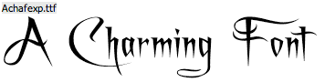
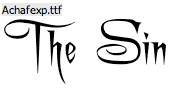
We like this font because it is scratchy and easy to read. We got it from the Distorted category. We went onto this category because we thought, our characters are distorted and a bit weird so, we might be able to find a font that would excentuate the characters personalities this would be good. Although we like this font, we have decided that the writing is slightly too normal for our liking. The scratchyness of the font is good, but its not quite weird enough for our 2 minute clip of 'The Sin'.
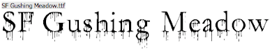
After we choose this font, we looked at it again and realised that none of us really liked it, so this is a definate no from the whole group. This font came from the distorted category. We don't like it because it would be quite hard to read when the credits are going though. Also we think that it i a bit busy whereas we want our font to be simple bit effective, so that it is noticiable but the main attention is on the action going on in the background. Another problem with it is that it is to all over the place and complicated which is not what we want.
This font is the last out of the four that we have chosen and we have all come to a decision that this is our favorite and the one we should use for our main title and credits. The reasons we have chosen this one is that it is simple enough to not draw to much attention from the view but yet it is not so boring that it does have character. Also, it fits into the movies genre (thriller). We got this font from the gothic category which we weren't expecting to find anything we liked in it, but we did. This font has a slightly medieval feel to it, to begin with we weren't so keen on that because we wanted the font to portray the youngness of the two young teenage girls, but after looking through them all and discussing them with in the group we decided that the older style writing could show and bring out the maturity of what they were doing (there obsession).
Our final Title of the Movie:
No comments:
Post a Comment